
Category: Cultural institutions
Collection Visualisation

This post is just a collection of examples that relate to the visualisation of collections. It saves me sending a number of tweets back to two colleagues in the US who started a conversation about this over the weekend: @sjwilder100 (from UNC Charlotte Library) & @lorcanD (from OCLC)
Several researchers are doing some interesting work in this space and I think it is pretty important. Adding some kind of visual layer to catalogues, search or discovery tools provides us with a capabilty that is largely missing in the cultural sector at present. Most searches focus solely on text-based initiators or they provide text-based lists of search results. Open data, the encouragement to collaborate in coding and the need to either search visually or to visualise search results is leading towards much improved collection discovery. This makes the collections we provide more easily found, used, explored, enjoyed, linked and shared. So here are a few examples that I’m aware of, in no particular order, mind the step:
Marian Dörk is a postdoc researcher at Newcastle University. You can see several examples of his visualisations here http://mariandoerk.de/ I like the PivotPaths and you can even demonstrate them for yourself on his site http://mariandoerk.de/pivotpaths/
Mitchell Whitelaw does some fascinating research relating to collection visualisation and has worked with archival, photographic and art collections. You can see an example relating the the exploration of Australian Prints here (a research project with Ben Ennis Butler) http://mtchl.net/explore-australian-prints-printmaking/ What I like about Mitchell’s work is that he crafts in some great design that entices the user to explore because the interfaces are both generous and beautiful.
Tim Wray is still undertaking his PhD at Wollongong, but he has already done some interesting work with art collections that provides navigable pathways for collection exploration: http://timwray.net/2012/12/create-pathways-at-your-fingertips/
Mr Chris Gaul was UTS Library’s first Artist-in-Residence in 2012 and you can see some of his conceptual ideas for collection discovery here: http://www.chrisgaul.net/utslibrary/ His Library Spectogram is shown in the image above and was the inspiration for our colourful collection ribbon that allows you to browse our monograph collection or see your search results presented visually http://find.lib.uts.edu.au/
Paul Hagon is a friend and former colleague who is the Web Developer at the National Library of Australia. He has done some interesting experiments relating to colour and search results in visual collections. Here is a search by colour experiment: http://ll04.nla.gov.au/ and here is a concept that visualises the colours of tags used in Flickr http://www.paulhagon.com/2010/05/14/colours-of-a-tag/
Over the last few days Serendip-o-matic was released. It is a collaborative project by a team of twelve people from academia, libraries and museums and I know of researchers here aut UTS who have already found it very intriguing. What is really great about this is the serendipity it provides. So go on, give it a whirl!
I know that I’ll have left out some other great examples from people working in this space including Georgina Hibberd, a researcher at UTS who has some really wonderful ideas about visualisation and the discovery of library collections. So, if you know of someone worthwhile, just let me know and I’ll add them to this little collection.
Postscript additions:
Since I first posted this Marian Dork has reminded me of the very beautiful and playful interfaces created at the University of Calgary in their Bohemian Bookshelf http://www.alicethudt.de/BohemianBookshelf/ My apologies for forgetting to add them to the list above earlier.
Library Chat » Episode 8 – Mal Booth – Culture, Creativity, Play, Meetings
Library Chat » Episode 8 – Mal Booth – Culture, Creativity, Play, Meetings.
This a podcast of an interview that I did with Corin the Librarian (@corinh) in Auckland. It was done a while back and I’ve only just had a listen to it. I’m amazed at how coherent it is. Maybe it is all due to Corin’s editing, or maybe it was someone else impersonating me!
Libraries and the digital future
This is the presentation I gave to a City of Sydney Libraries seminar on 27 June 2013. It was only a short presentation so it isn’t comprehensive. Presenter’s notes are included in the pdf file.
The art of data visualisation
This morning I sat down and watched this video about the art of visualisation. http://www.openculture.com/2013/05/the_art_of_data_visualization_.html It is introduced and rounded up by Edward Tufte. There are some excellent tips on how good design can help to tell complex stories. My apologies if this all looks a bit like teaching someone how to suck eggs. Those points made that rang a bell with me:
-
It isn’t a new art form. It probably started with mapping, centuries ago.
-
It is at least in part about pattern recognition as this is easier in the visual sense because our brains quickly recognise patterns. (I know some people who can easily do this in a sheet of numbers too, but that is another story. My Dad died recently and he was one of these people.)
-
It is important to recognise that it is also about emotions and that is where aesthetics play a big part.
-
Visual storytelling aids in comprehension.
-
Like any form of design, you must start by understanding deeply.
-
I liked the guy who said that clever and aesthetic design can “invite people in”.
-
There are important links between art and culture. Currently our former artist-in-residence (Chris Gaul) and I are busy agreeing with each other that there is really no difference between some great design and great art.
-
Good visualisation is about revelation; revealing things not seen or not easily seen.
-
Remember your audience, they are smarter than you think, so treat them with respect.
-
Know your content.
-
Finally I think Tufte himself makes the point that sometimes ambiguity is a good thing. It can also be about “unknowing”.
Cultural institutions should do more of this. It is far more effective than dull annual reports.
And below you can see one of my favourite examples of data visualisation by Irene Wellington:

Some thoughts about MONA (Part 2)
I promise this is the last in the series of hand-written posts about Tasmania. It just seems appropriate to wrap it all up the same way.


Some thoughts about MONA (Part 1)
Here is Part 1 of my reflective thoughts on MONA in Tasmania. Part 2 is here.


Theatre of the World (past exhibition) http://www.mona.net.au/past-exhibitions
Smith Journal http://www.smithjournal.com.au/
The Onion http://www.theonion.com/
Fender Katsilidis Architects http://www.fkaustralia.com/
My images of MONA on Flickr http://www.flickr.com/photos/malbooth/sets/72157633236587086
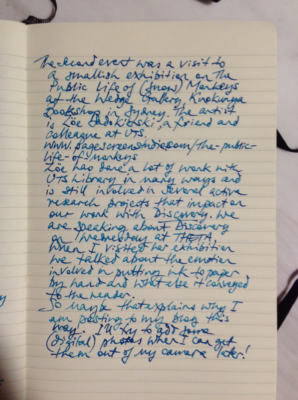
#THETA13 Search to Discovery (Part 2)


From Search to Discovery at UTS:LIBRARY #THETA2013


This is Part 1 of a few. We only have 25 minutes to present, so I’ll cram in some extras via this blog.
THETA 2013, Sunday in Hobart


What would Andy Warhol do?

Sketched on my iPad whilst watching the documentary.
Last week I found the time to watch all four hours of Ric Burns’: Andy Warhol a documentary film (it is in our library collection). It is divided into two parts – his earlier period and his later period. I watched the second part first. I don’t know why. I had recorded them from ABC TV ages ago and I guess I found them in that order.
In NYC last year I saw Regarding Warhol, Sixty Artists, Fifty Years at The Met and enjoyed it, but now I wish I had seen this doco or read more about him beforehand. I had some awareness of the popular Warhol images, but not enough to fully appreciate his impact on art in the last century, nor how and why he went about it. He wasn’t one of my favourite American artists of the post-war period. I’m more of an abstract expressionist fan, so for me it is always a hunt for Clyfford Still, Mark Rothko, Lee Krasner, Franz Kline, Joan MItchell, Philip Guston, Pollock, de Kooning, etc. As for pop art, I guess I liked Jasper Johns, Robert Rauschenberg and Roy Lichtenstein more than Andy. I had not appreciated his background, nor the influence he had on modern art and pop culture; not fully. Maybe not at all really. I have always wondered whether the artistic work itself is more important than the influence of the artist, but as one curator says in the documentary, you could say the most influential artist of the first half of the C20th was Picasso and it was Warhol in the second half.
The earlier part went into his childhood and his experience of art school. He was a good draftsman and could draw in his own fluid style really well, even though he did not think so. He seems to have had an enormous inferiority complex his whole life, but that is another story I guess. When he moved to NYC he first worked and became very successful as a commercial artist and illustrator for magazines. This is where he made a buck and financed his first explorations into the much poorer art world. In this period I think he produced some really beautiful images that they showed in the doco including his shoe illustrations, the “Progressive Piano” (1957) and the beautiful coloured birds in “Female Head” (also 1957). Despite this, he apparently he sold very little as an “artist” in several of his unsuccessful small shows. As I think the collector and gallery manager/owner Irving Blum said: Americans bought big cars and boats but they did not buy art in the 50s and 60s. It is worth noting that the clever Blum purchased the Campbell’s Soup exhibition set (after its display in his California gallery) for $1,000. He sold it many years later to the MoMA for $15 million.
As a successful commercial artist he tried to attract the attention of other successful artists like the writer Truman Capote (with an entire exhibition devoted to him) and both Johns and Rauschenberg, visual artists like Warhol, who snobbishly refused to have anything to do with him because of his profession and his flamboyant manner (both were apparently still entrenched in their closets). Perhaps this closeting of true self is why neither were as influential with others as Warhol was? This seemed to be at a stage when he was still exploring and developing his own pop art style, but before he started his more bohemian collaborations with a vast collection of “creative” misfits from both the upper and lower echelons of contemporary society but not, according to the documentary and those interviewed, like Billy Name and various writers and artists, with anyone from the middle class. With the Factory he created an artists’ collective, a space where people could be collaboratively creative and explore new forms of artistic expression. He dabbled in film (with people like Paul Morrissey), music (like the Velvet Underground), silk screen printing, magazines (Interview), sculpture and briefly even operated a dance club in Manhattan. He found artistic merit in mass produced images (like advertisements, printed photographs in newspapers or even Most Wanted posters) and made popular culture and popular celebrities (Brando, Taylor, Monroe, Presley, etc.) into iconic images through his own obsession with them and his unique form of mass produced and vibrantly coloured portraits. Warhol seems to have been fascinated by what others disregarded as ordinary and he was gifted enough to raise the ordinary into an art form, paving the way for others to follow in this vein, like Jeff Koons I suppose.
Many curators said he was truly gifted with colour, which is a bit obvious I suppose when you think about it, but I also learned that he was a great and inventive technician too (e.g his blotted line technique and his screen prints). He dragged in potential collaborators off the street, like Jed Johnson (a one-time boyfriend and later designer to the stars). It seemed to be a very free-flowing period in which he went with the cultural flow and explored possibilities because he could. But he could not say no easily and that probably led to his shooting by the writer and crazy person Valerie Solanas.
Not surprisingly, that seems to have been a turning point in his life and the second period seems to have been more commercially successful and more business-focussed with partners who encouraged him to concentrate on producing art that sold or that was commissioned. (Even so, nobody seems to have mentioned anyone measuring his success with things like KPIs or business objectives.)
Various people who knew him were interviewed and some said he was easy to dislike and unpleasant, particularly in his later years. He is described as withdrawn and fearful of close contact and affected, but I think those who knew him best said he was magnetic and also a very complex person.
As well as inspiring me to further our efforts with our cultural programs, all of this made me think. I think it made me think more about the value of artistic collaboration and about not knowing where that might lead or even what it might deliver. I was reminded of discussions I had last year with a few colleagues about the usefulness of useless knowledge, by Warhol’s inspiration from rather ordinary images. And I was again reminded of the dangers of the mindless nature of a one-eyed pursuit of efficiency: by anyone really, but certainly by a cultural institution, and even in a university, a library must recognise that it is a cultural institution. I think libraries have a lot more to learn from Warhol than they do from Jack Welch and sundry successful business theorists, but it is worth noting that Warhol himself always recognised that he also had a sharp business brain. That’s the bit that confuses me, but I guess it is also where the folk from our Design School come in because the art they produce seems grounded in all kinds of practical reality. Warhol seems to have started as a successful visual communicator in the 1950s and whilst he dabbled in so many other things a continuing thread in his artistic output seems to me at least to have been his gift for communicating through the visual image. I know that I’ll view the next Warhol exhibition that I see with different eyes.
I’ve recently been asked by a few people about how I measured the effectiveness of our arts and cultural programs. I gave some rational answers that I don’t intend to go into here. In future I intend to say “by shoe size”.
