Tagged: data visualisation
11-808 & Conversations : Artist-in-Residence, 2014

Elisa Lee and Adam Hinshaw partnered as the UTS Library Artist-in-Residence for 2014. Works from this Residency are now prominently displayed in the UTS Blake Library in Haymarket, Sydney.
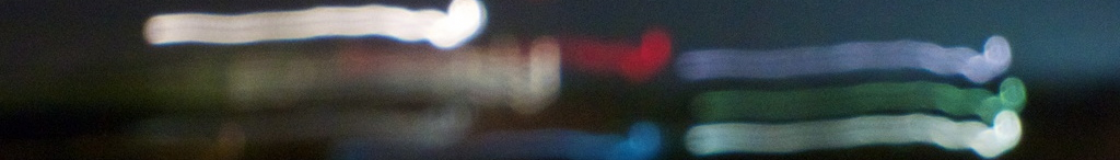
Their brief was to provide an artistic interpretation of the UTS Library Retrieval System (LRS). Their resulting major work 11-808 is a live data visualisation that interprets the use of the LRS in real time. The purpose of the entirely underground system needed to be communicated to a wide audience, illustrating how the system was being used and demonstrating its value to the UTS community. The brief was extremely challenging, with a tight budget and deadline, but Elisa and Adam’s work has exceeded expectations.
The result is an elegant and poetic display of data that shows how this system is being used and, via the catalogue of library metadata, the dynamic movement of collections around the Library ecosystem. Through their artists’ perspective, beauty and the interaction of colour, Elisa and Adam have conveyed meaning and understanding to an extent that I think Joseph Albers* would have approved.
They also provided a playful sound installation, Conversations, that explores the random nature of the ways books are stored within the 11,808 steel bins of the LRS, arranged only by spine height. Here they have provided audible “conversations” between the books in selected bins.
Their work is artistically beautiful, superbly designed and technically very clever. Both works are eloquent in conveying meaning as well as exploring and highlighting the nature of this system. In doing so they have provided attractive and engaging works that appeal to the curiosity of Library users and that speak to them in very contemporary language.
* See also https://www.lib.uts.edu.au/news/304412/colour-on-concrete-exhibition
The art of data visualisation
This morning I sat down and watched this video about the art of visualisation. http://www.openculture.com/2013/05/the_art_of_data_visualization_.html It is introduced and rounded up by Edward Tufte. There are some excellent tips on how good design can help to tell complex stories. My apologies if this all looks a bit like teaching someone how to suck eggs. Those points made that rang a bell with me:
-
It isn’t a new art form. It probably started with mapping, centuries ago.
-
It is at least in part about pattern recognition as this is easier in the visual sense because our brains quickly recognise patterns. (I know some people who can easily do this in a sheet of numbers too, but that is another story. My Dad died recently and he was one of these people.)
-
It is important to recognise that it is also about emotions and that is where aesthetics play a big part.
-
Visual storytelling aids in comprehension.
-
Like any form of design, you must start by understanding deeply.
-
I liked the guy who said that clever and aesthetic design can “invite people in”.
-
There are important links between art and culture. Currently our former artist-in-residence (Chris Gaul) and I are busy agreeing with each other that there is really no difference between some great design and great art.
-
Good visualisation is about revelation; revealing things not seen or not easily seen.
-
Remember your audience, they are smarter than you think, so treat them with respect.
-
Know your content.
-
Finally I think Tufte himself makes the point that sometimes ambiguity is a good thing. It can also be about “unknowing”.
Cultural institutions should do more of this. It is far more effective than dull annual reports.
And below you can see one of my favourite examples of data visualisation by Irene Wellington:

