
Tagged: search
What is Inevitable about UTS Library (Pt 1 of 3)
This is the guts of a presentation I gave at EduTECHAU on 9 June 2017. It’ll be a bunch of images, text to explain those images and a few links.
Thanks to my colleague Dr Belinda Tiffen for her assistance with this presentation: she is much smarter than me.

Last year I read Kevin Kelly’s book The Inevitable and I was struck by the way he described the 12 technological forces that he thinks will shape our future. The forces are named in the image above, but they’re not all that easy to understand. I’ve thought more about them and believe that at UTS Library we are actually making progress in all these areas, not always exactly as he describes, so I’ll outline what some of our initiatives are in the following images and text. For the sake of brevity, the only force I won’t be illustrating is Tracking, but rest assured that we are already doing some of that too and in fact you can see it in some of the examples I am using.
I am concentrating on three major areas: discovery and search; open access; and cultural and artistic stimulation.

For Discovery & Search I see our efforts are consistent with the four forces and examples illustrated above: Becoming; Accessing; Cognifying; and Filtering. We are in the process of completely redesigning our discovery interface on the basis of some in-depth UX research that we conducted ourselves. We have long taken an iterative approach to website and digital services development, and our latest work builds on that. In our UX work we have recognised that there is a spectrum of user needs and behaviours from search to discovery, so we are adding new features to aid and enhance discovery, but they are designed in a way that will not distract or delay those searching for known items and wanting to get out of there fast. Our collection development has seen major improvements with regard to collaborative borrowing arrangements and these options needed to be carefully included and distinguished in the search/discovery catalogue in order to increase the options available to our users, while not confusing them with respect to immediate availability. Finally as others like Amazon, Uber and Netflix have done we are introducing features that allow for a more personalised and tailored search and discovery experience, should the users opt in.

In response to our research insights and user feedback, the following slides outline the initial user interface concepts for UTS Library’s new search and discovery system. These solutions have been designed from the responses and feedback gathered from our previous wireframe prototypes.
The following design concepts will be developed into a working prototype where the new search engine can undergo further user testing in conjunction with the user interface.

Overall search page results in our catalogue. From left to right you see columns arranged to show search filter options; search results list and a new contextual discovery panel.
The addition of a contextual discovery side panel to provide the user with results that are personalized to the individual. This feature will assist the user in the discovery of information that the system believes will be helpful to them. Information will be displayed based on their search request and will provide related content matched to a logged in users profile.
Article results intergration: A common request amongst users of our current system is for the ability to combine Article results in a search with Books and Journals.
Using the default ‘All’ search, the new system will combine the top 3 Article results alongside Books and Journals.
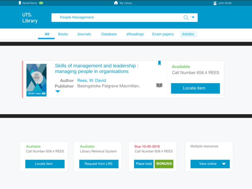
This slide shows a few new features related to the item display within search results:
- Ribbon colour display: (LHS of record) Integrating the colour ribbon into the catalogue items establishes the direct link between the two. For users, this creates a better understanding of the search functionality the ribbon has. It also more directly displays the relationship between the search results and the items physical location within the library
- Shelf view: Shelf view button is located under the book cover display; this better suggests shelf views functionality to the user.
- Save item: Save item button enables a logged in user to quickly save an item of interest to a list.
- Item status: Improving the clarity of an items status means a user can quickly see an item’s availability and its location.
- Locate item: Simple and clear call to action buttons has been added to each item. This button describes the necessary action to preform in order to get the item.
- Call to action buttons (options are shown in the lower image above) The description on the call to action button indicates to the user where that item is located. For example, an item on the shelf will indicate where to “Locate item” or if an item is in the LRS it will indicate to “Request from LRS”. If an item is unavailable the call to action button describes to the user what further options are available to receive that item. When multiple resources are available for one item the button will display a drop down menu. This drop down will display the available recourse types to choose from.

Discovery of related items: The contextual discovery panel (“You may also like …” on RHS of full item page) will have the flexibility to provide related content to a particular item. On the Item page, the discovery panel can suggest related books by the same author or display items other people have viewed or borrowed.

It is of course fully responsive design, meaning the experience is fully optimised for mobile devices.
End of Part 1. Part 2 is here. Go there now. Do it. You know you want to.
Collection Visualisation

This post is just a collection of examples that relate to the visualisation of collections. It saves me sending a number of tweets back to two colleagues in the US who started a conversation about this over the weekend: @sjwilder100 (from UNC Charlotte Library) & @lorcanD (from OCLC)
Several researchers are doing some interesting work in this space and I think it is pretty important. Adding some kind of visual layer to catalogues, search or discovery tools provides us with a capabilty that is largely missing in the cultural sector at present. Most searches focus solely on text-based initiators or they provide text-based lists of search results. Open data, the encouragement to collaborate in coding and the need to either search visually or to visualise search results is leading towards much improved collection discovery. This makes the collections we provide more easily found, used, explored, enjoyed, linked and shared. So here are a few examples that I’m aware of, in no particular order, mind the step:
Marian Dörk is a postdoc researcher at Newcastle University. You can see several examples of his visualisations here http://mariandoerk.de/ I like the PivotPaths and you can even demonstrate them for yourself on his site http://mariandoerk.de/pivotpaths/
Mitchell Whitelaw does some fascinating research relating to collection visualisation and has worked with archival, photographic and art collections. You can see an example relating the the exploration of Australian Prints here (a research project with Ben Ennis Butler) http://mtchl.net/explore-australian-prints-printmaking/ What I like about Mitchell’s work is that he crafts in some great design that entices the user to explore because the interfaces are both generous and beautiful.
Tim Wray is still undertaking his PhD at Wollongong, but he has already done some interesting work with art collections that provides navigable pathways for collection exploration: http://timwray.net/2012/12/create-pathways-at-your-fingertips/
Mr Chris Gaul was UTS Library’s first Artist-in-Residence in 2012 and you can see some of his conceptual ideas for collection discovery here: http://www.chrisgaul.net/utslibrary/ His Library Spectogram is shown in the image above and was the inspiration for our colourful collection ribbon that allows you to browse our monograph collection or see your search results presented visually http://find.lib.uts.edu.au/
Paul Hagon is a friend and former colleague who is the Web Developer at the National Library of Australia. He has done some interesting experiments relating to colour and search results in visual collections. Here is a search by colour experiment: http://ll04.nla.gov.au/ and here is a concept that visualises the colours of tags used in Flickr http://www.paulhagon.com/2010/05/14/colours-of-a-tag/
Over the last few days Serendip-o-matic was released. It is a collaborative project by a team of twelve people from academia, libraries and museums and I know of researchers here aut UTS who have already found it very intriguing. What is really great about this is the serendipity it provides. So go on, give it a whirl!
I know that I’ll have left out some other great examples from people working in this space including Georgina Hibberd, a researcher at UTS who has some really wonderful ideas about visualisation and the discovery of library collections. So, if you know of someone worthwhile, just let me know and I’ll add them to this little collection.
Postscript additions:
Since I first posted this Marian Dork has reminded me of the very beautiful and playful interfaces created at the University of Calgary in their Bohemian Bookshelf http://www.alicethudt.de/BohemianBookshelf/ My apologies for forgetting to add them to the list above earlier.
